The Delta Issue #107
The State Assessment Tool Every Education Leader Should Bookmark
Hi y’all, Jessica here.
We spend a decent amount of our days in education talking about being more data-driven and outcomes-focused. So why is one of the most basic ways we measure how kids are doing—state assessments—still so hard to access and use?
Every state publishes assessment results, but they publish them in different places, in different formats, through dashboards of very varying quality, and with different definitions of what “proficient” even means. If you want to understand how kids are doing across the country, get ready to decode a handful of spreadsheets.
Dr. Emily Oster and the team at the Education Data Center saw the problem—and decided to do something about it.
They’ve done the painstaking work of pulling together state assessment results from all 50 states and D.C.—plus Puerto Rico and the U.S. Virgin Islands—and putting them in one place. And now they’ve built Zelma, an AI tool that lets you ask questions about those data in plain English and get a chart, table, and written answer in seconds.
Want to see how 4th grade math proficiency has changed in Texas over the past decade? Look at 7th grade ELA results across districts in Virginia? Dig into results for a particular student subgroup? All you have to do is ask.
I encourage everyone reading this to go play with this tool. And while you do, here are three things I really appreciate about what Dr. Oster and her team have built:
1️⃣ They made the data ridiculously easy to use
The Education Data Center is built largely from data states already publish. The problem wasn’t that the information didn’t exist. The problem was that it was too hard to use.
Dr. Oster and her team did the tedious work for us. They pulled results from state education agencies across the country, cleaned and organized them, matched them with federal data, and put them all in one place.
Then they made that data accessible to pretty much anyone. You can explore it on a map, drill down from states to districts and schools, download a clean file, or just ask Zelma a question like you would ChatGPT.
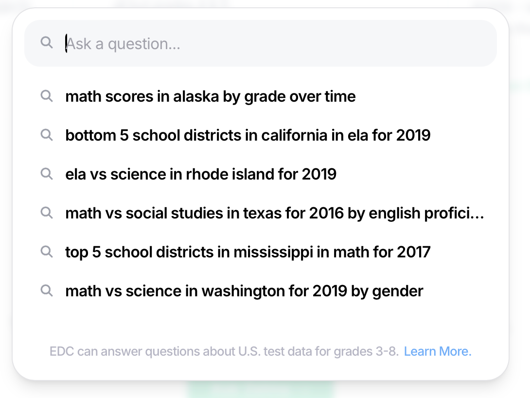
When you have questions about how your state compares with its neighbors or how it’s doing today versus a decade ago, you no longer have to hunt through state websites—which, let’s be honest, are not particularly fun places to hunt around. Dr. Oster and her team took information and made it both accessible and actionable.
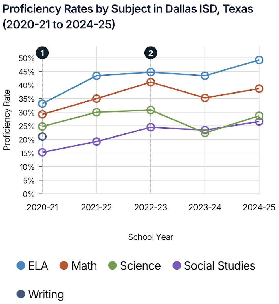
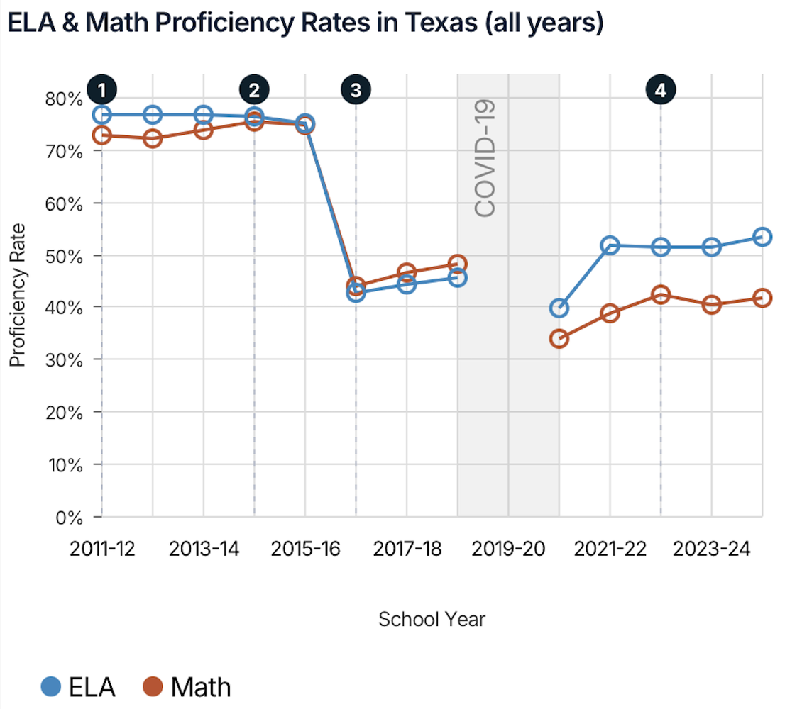
(For example, here are a few sample charts from their site—all interactive on the original platform, making it easy to click around and spot trends.)
2️⃣ You can see the story, not just the snapshot
One of my favorite things about this tool is that it doesn’t just tell you how kids did this year. For some states, the Education Data Center has assessment results going all the way back to 1998.
We know one year’s number rarely tells the whole story. To understand what’s really happening in your classrooms—and whether what you’re doing is having a positive impact on kids—you need to take the long view. If you’ve invested millions in a new reading initiative, changed curriculum, or launched a statewide tutoring program, you should be able to look back and see whether student outcomes changed, and whether those changes lasted.
Now, instead of digging through years of old state files to figure that out, you can see the trajectory in one place.
3️⃣ They put transparency front and center
There’s another thing I really appreciate about what Dr. Oster and her team are doing: they’re committed to telling the full story.
State assessment releases often come with a headline that focuses on the positive. And while I’d like to believe we’re always putting a microscope to the numbers and being candid about what they show, the full story is almost always more complicated.
In Dr. Oster’s EDC State Test Score Results Substack, which tracks and analyzes state assessment results as they’re released across the country, she and her team look closely at what changed, what might be driving the results, and what context you need to make sense of them. They’ll flag when a state changes its proficiency cut scores, show when gains are concentrated in certain grades or subjects, and, when the numbers don’t quite match the victory lap, they’re willing to say that too.
I commend that kind of transparency because the goal shouldn’t be to find the best story in the numbers. It should be to understand what they’re telling us about kids.
Final thoughts
I’m very glad Dr. Emily Oster and her team built this; truthfully, I’m also a little amazed that they had to. We have 50 state education agencies, a U.S. Department of Education, and more education data than any reasonable person knows what to do with. Yet if you want one clean place to see state assessment results from across the country, private researchers had to build it.
Kudos to them, truly. And perhaps there’s a lesson here for all of us in education: It’s not enough to collect and publish data. We have to make it easy enough for people to use it.
So go ask Zelma a question about your state. Then ask yourself a harder one: Could someone get that answer this easily from us?
Let’s Get Muddy
- If you’re interested in NAEP data, which isn’t included in the Education Data Center, Watershed has a dashboard of our own for exploring NAEP results. Check it out to see how your state is doing on the Nation’s Report Card, explore trends over time, and compare performance across states and student groups.